Pairing Rich Colours With The Right Hardware
23rd March 2026
Rich colour palettes and earthy tones continue to shape interior design in 2026. From deep blues and heritage greens to warm neutrals, terracotta and muted pink hues, one detail truly completes the look. Architectural hardware.
When thoughtfully selected, hardware doesn’t simply complement colour, it elevates it.
At Croft, craftsmanship and finish are integral to the design story. Here is how to pair rich colours with the right hardware to create interiors that feel both timeless and effortlessly trend aware.
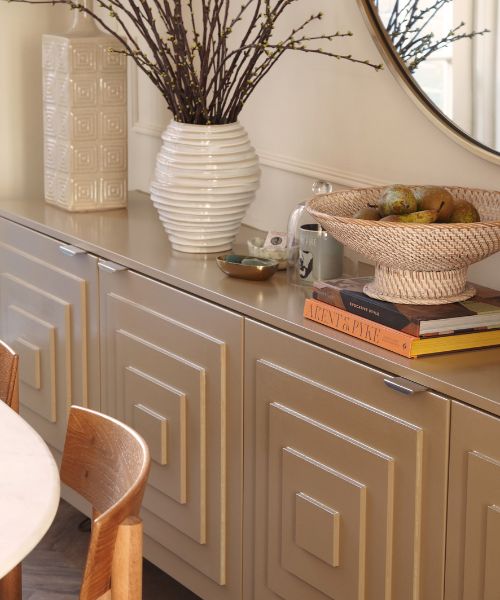
Warm Neutrals
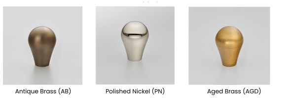
Taupe, putty and clay tones call for subtle luminosity. Pearl Nickel enhances softness without excessive shine, while Light Antique Brass adds gentle architectural definition. Against earthy undertones, bronze finishes bring cohesion and quiet sophistication.
.jpg)
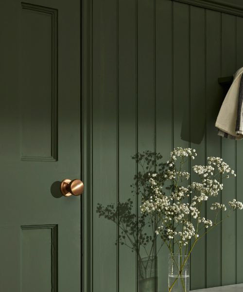
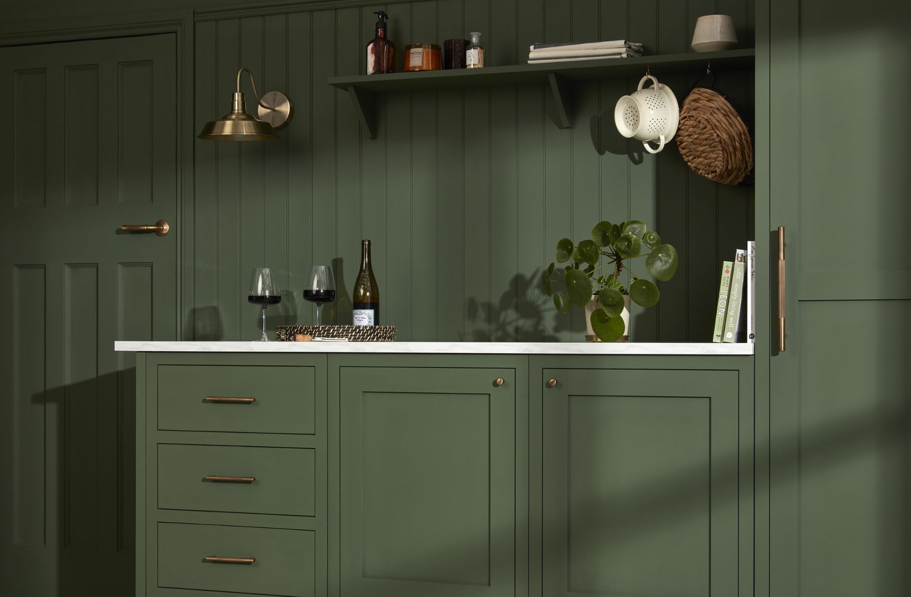
Deep Greens
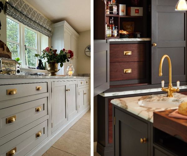
Forest, olive and moss tones feel grounded and confident. Pair them with Polished Brass or Light Antique Brass to introduce warmth and classic refinement. For a more contemporary mood, Dark Bronze Metal Antique creates depth without overpowering the palette.
.jpg)
Inky Blues
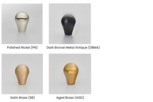
Dark and saturated blues remain a defining trend in luxury kitchens and bespoke cabinetry. Polished Nickel or Dark Bronze Metal Antique provide crisp contrast against cooler blue undertones. Satin Brass and Aged Brass soften the scheme while adding understated warmth. The key is balance, avoiding finishes that feel too stark or yellow in tone.
.jpg)
.jpg)
Pink Hues & Terracotta
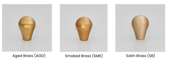
Terracotta and earthy red tones continue to grow in popularity within contemporary interiors. Antique Brass echoes their natural warmth, while Polished Nickel introduces refined contrast. For muted or dusty pink palettes, Aged Brass offers a considered golden accent without feeling overly decorative.
Rich Greys
Charcoal and soft grey tones create confident and dramatic backdrops. In these spaces, hardware becomes a focal point. Aged Brass and Smoked Brass deliver striking contrast, while Satin Brass maintains a softer and more nuanced finish.
In any interior space the unwritten rule is to follow the undertone.
Rather than matching colour at face value, consider how light, texture and finish influence character. The most successful interiors feel intentional. When colour and hardware are chosen in harmony, every detail contributes to a space that feels effortlessly curated.
Discover our Collections